

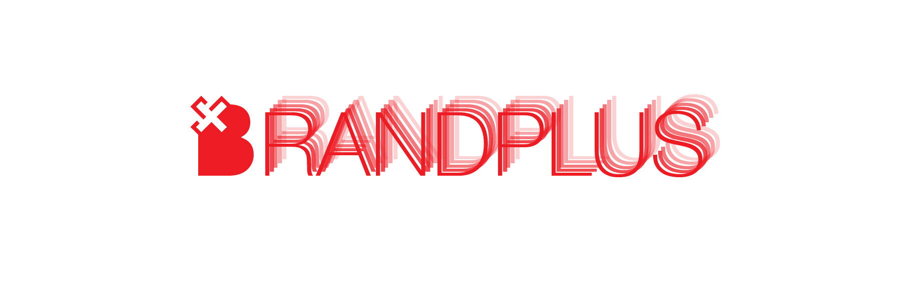
BrandPlus
Nurturing and healing brands using design methods.
In a seemingly accelerated and more emotionally disconnected world, the desired relationship between consumers and brands have become one of meaningful connections, not just delivery of differentiated products or services.

Many brands that excel today tend to lose themselves and get exhausted from the daily rote activities of delivering on their promise. This causes agility to decrease, meaning to take the back seat, and the brand eventually suffers from stunted growth with an existential crisis.
BrandPlus is a strategy and design agency that rehabilitates such brands. It helps brands rediscover their purpose and rekindle their energy and connection with their consumers, as they evolve in the marketplace. They use proprietary tested design methods to diagnose and remedy problems these brands face, and help bring them back to life.

CHALLENGE
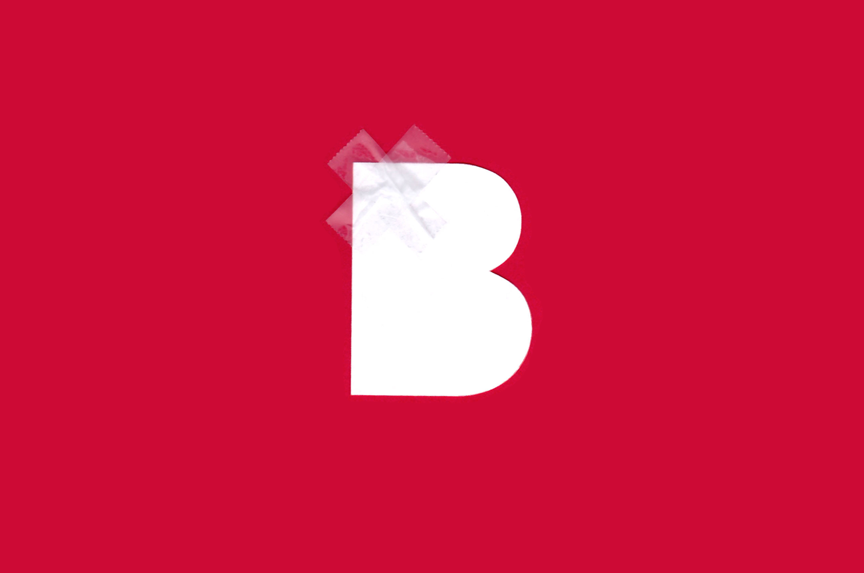
The agency wanted a new brand identity that communicates its role as a “primary care doctor” for growing brands. They also wanted a brand mark that implies that they do more than just branding, which is indicative of their name. The mark was expected to be simple, flexible and easily extendible across different media.

APPROACH
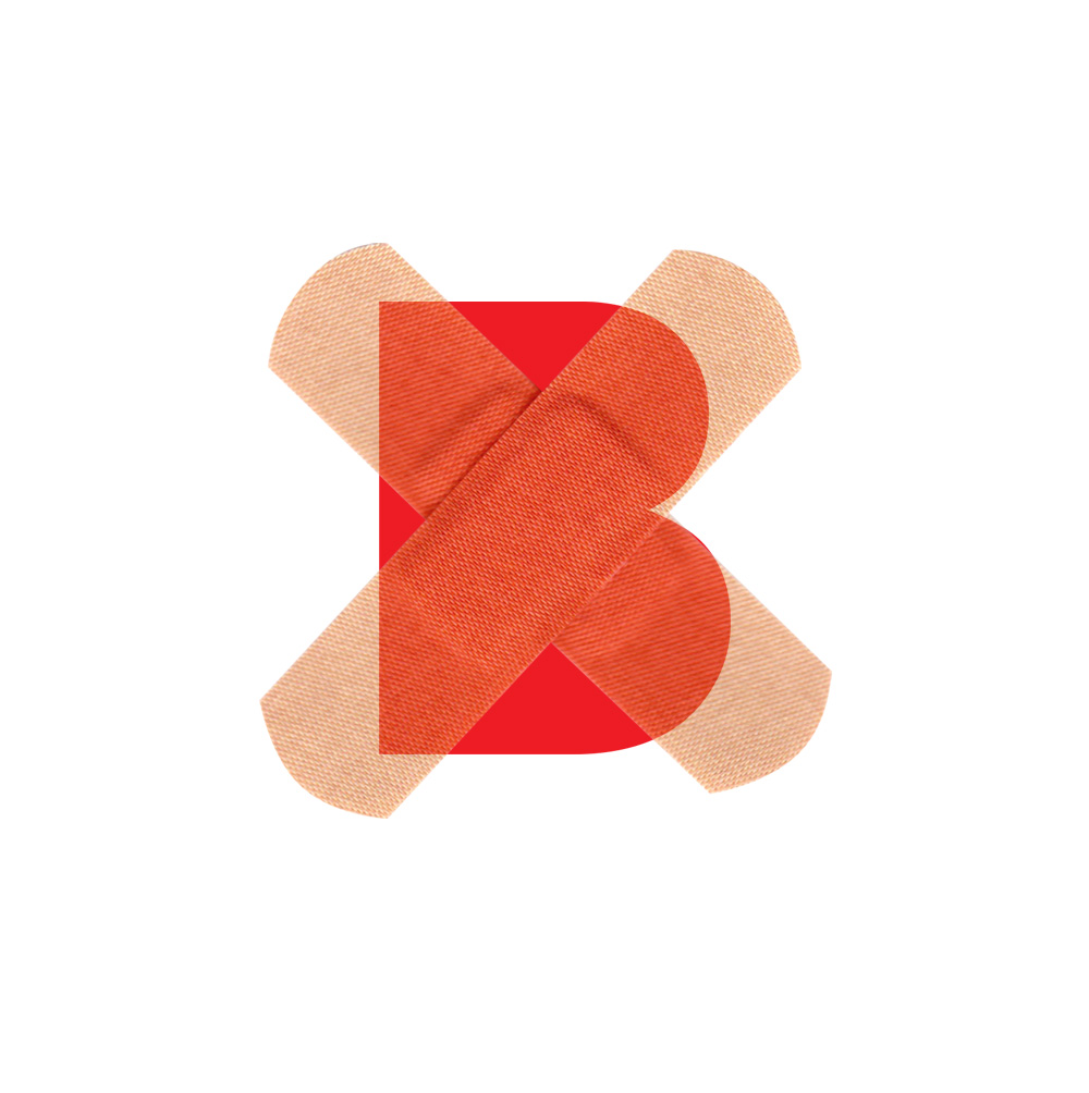
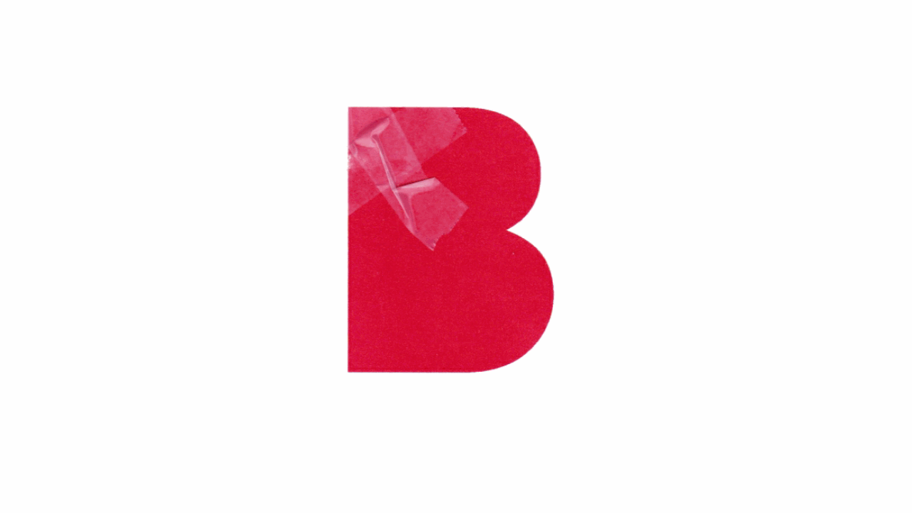
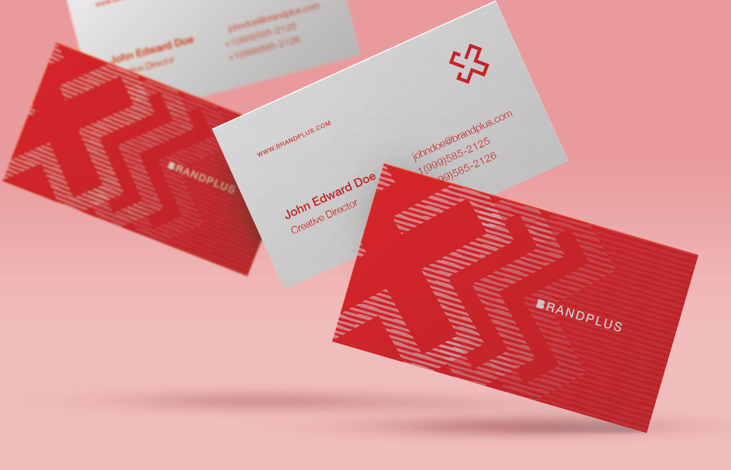
I experimented with different mockups that resulted in an idea for a mark created from a modern typeface. A letter ‘B’ without counters, and a plus sign that doubles as two adhesive bandages. The bandages are supposed to convey healing and care.
PROJECT SCOPE
Brand Identity Design
Brand Collateral
RESULTS
Because of the simplicity of the central idea behind this mark, it allows for a dynamic interpretation, whereby it can morph into other marks and lends its graphic design elements to communicate the essence of the agency and its services in different media.


COLOR SPECIFICATIONS

TYPOGRAPHY
Because of the very geometric nature of the “B” icon and it’s modern look, I found a necessity to use a typeface that has a modern look with contemporary proportions.
I also wanted to employ a typeface that will contrast the bold and solid look of the icon, so I chose Helvetica Neue Thin.


